OUR CTA MUST’VE WORKED IF IT GOT YOU HERE!
That means we’re off to a good start when showing that we really are conversion experts.
Writing a CTA in email marketing is how marketing strategists aim to engage customers in their marketing efforts. While these are a seemingly simple part of an email marketing strategy when comparing it to designing a template, email marketing funnel set up and analysis, or even just figuring out what to talk about, CTA buttons are a crucial part of a holistic marketing strategy.
Plus, it’s the thing that gets conversions.
At MAKE, we’ve learned that rules are a good and a bad thing. They’re a way of holding ourselves accountable to make sure we have everything we need in a piece of content, like an email, for example. But they’re also extremely arduous to make in the first place. Because so much of marketing is a moving target, rules are pretty much meant to be broken at MAKE Digital Group.
Our rule of thumb is to try and adhere to all of the rules, but if there is one that needs to be broken, have a darn good reason for doing it. Be able to back up every decision with a purpose.
Here are the 5 rules we have for creating a CTA in email marketing (and examples of times when it’s OK to break them).
Rule #1: Only provide 1 CTA per email.*
The holy grail of all rules. While sometimes people think that more options will help someone find a CTA that works for them, it can confuse or overwhelm a reader. In marketing, we call it an attention ratio.
Attention ratio is the ratio of what someone can do on a given page vs. what you want them to do. Any good marketing campaign should have a ratio of 1:1.
The more options you give a customer, the more likely you are to lose their attention. This has been proven time and time again, starting with the Jam Study in 2000. In this study, researchers found that when customers were 27% more likely to make a purchase when faced with only six types of jam than when offered 24 choices. Other studies have found similar results, as well.
The Paradox of Choice, a famous TED talk by psychologist Barry Schwartz, goes deeper into this idea if you’re interested. This idea explains anything from why someone is single to why people buy more things at Trader Joes than Walmart, even though it’s a smaller space with vastly minimized options.
He says that there are two adverse effects of having so many options:
- Choice paralysis: With so many options to choose from, people find it hard to make a decision at all.
- Buyer’s remorse: The more options there are, the easier it is to regret anything that may be wrong with the decision you made.
The point is: If you want your customer to make a decision, lead them to water as opposed to handing them a map with a variety of different routes.
RULE BREAKER
But, we have an asterisk next to the title because this isn’t always the rule.
As is the way with marketing, this can always depend on the situation. If you’re trying to sell different products or ideas, you can separate your email by sections with more CTAs. We have an example of this below that you can check out.
Rule #2: Tell a cohesive (and compelling) story.
CTA in email marketing don’t work in a vacuum by themselves — they rely on the design and content to tell an entire story. Think of it as the climax of a book: everything should be leading up to that point.
A few of our favorite email design layouts include:
- Inverted Pyramid: This style structures the elements of an email like headers, imagery, and buttons into an upside-down triangle that funnels a customer’s vision straight to the CTA button.
- Zig-Zag: This format creates angles through blocking images and information to move readers through each step of the email. The pattern is also visually pleasing and makes content more comfortable to read.
- One Column: This layout is a mobile-first approach that adapts well to desktop. It lets the consumer navigate through the email easily while also making essential information more prominent.
All the imagery, design, and words should work together to lead someone to want to click that email CTA button.
RULE BREAKER
When you have a unique email design that relies more on graphics and imagery than an actual button click, it’s OK to steer away from a button-based design. For example, when you have someone sign up for a newsletter, you may not be so worried about whether or not someone clicks your button.
In these types of emails, your design should be less focused on a CTA in email marketing and more focused on delivering content that meets your reader’s expectations.
Rule #3: Make it worth their while.
Readers are smart nowadays. They know that the emails they get are trying to get them to do something, whether it’s to buy a product or read an article. Either way, they’re going to see it coming. And using yet another boring Shop Now or View Options CTA button just isn’t going to cut it anymore.
The trick is to let them know what is in it for them by highlighting benefits, setting expectations, and making it personal with your button content. End the story with a satisfying finish!
Here are a few examples we’ve used for our self-directed IRA client:
- If you want them to click a blog to learn about RMD changes: See how RMD changes affect me
- If you want them to open an account: Invest in my future
- If you want them to learn about their account options: Show me my options
- If you want them to contact you for more information: Contact us for free support
By letting them know exactly what they will get out of clicking a button, they’ll be more likely to move forward with the next step. Like Schwartz mentioned in his TEDtalk, you have to make the decision as easy and straightforward as possible if you want a customer to convert.
RULE BREAKER
Sorry — don’t break this rule. You should always make it worth your reader’s while.
Rule #4: Use action-based words.
When writing a CTA in email marketing, use precise, action-oriented verbiage to attract attention and entice a reader to do something. The goal here is to create a sense of urgency for clicking that screams, “Here today, gone tomorrow!” without actually saying that. Because it’s not 1990. We’re done with this phrase.
Here are a few examples of action-based CTAs and their boring counterparts:
- See the new looks (instead of View options)
- Start my trial (instead of Start your trial)*
- Take 50% off (instead of Shop)
*Note: You may want to consider writing your CTA in the first person. Unbounce found that changing button text from the second person (“Start your free trial”) to the first person (“Start my free trial”) resulted in a 90% increase in clicks.
RULE BREAKER
If your team has done ample testing on a consistent basis and have decided that your straightforward CTAs work better than more creative ones, stick with what works. Certain phrases may work better for certain industries, and it’s not up to one marketing company to tell you what to do.
Now that being said, don’t make the assumption that yours is working if you haven’t compared it to another version. A/B testing is a great way to enable these types of decisions.
Rule #5: Let it stand out.
The CTA button’s design is just as important, if not more important, than the words on it. To be optimized for mobile, your design should place the button in the upper part of the screen to allow consumers to be within their thumbs’ reach as they scroll.
The design for a CTA in email marketing should have the following attributes:
- White space: Having nothing else around it will let it stand out
- Complementary (but contrasting) color: Use a color that draws attention
- Bigger size: Make it more prominent than the text surrounding it
In short: It should be nearly impossible to miss the email CTA button.
RULE BREAKER
This is a rule that’s flexible enough that pretty much any email marketing company can find a way to bend the rules without breaking them. Whether you like pink or black buttons, prefer Helvetica or Roboto, make this rule work for you in a way that makes sense.
The only thing we ask is that you don’t use Comic Sans. That’s it.
BONUS RULE: Create a landing page worth landing on.
Clicking the CTA in email marketing is fantastic, but the real metric we’re looking for is conversion. And if a user lands on your page after clicking a CTA button but doesn’t do anything else, well, that’s not exactly a useful marketing strategy.
Make sure the content on your landing page tells the same story as your email message and is designed similarly as not to confuse your audience or make them think it’s a sort of bait-and-switch tactic.
A well-structured, easy-to-use website optimized for SEO is one of the most effective tools for businesses to see growth. If your landing page isn’t converting the way you want it to, it’s probably time to improve your website design in order to boost sales.
Our favorite email CTA examples
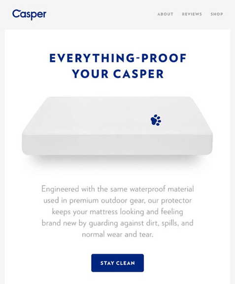
Why we like it: It’s simple, clean, and fun. It follows the funnel design, where the words and the design are leading straight toward the CTA button. There are no places to get distracted or leave the email.
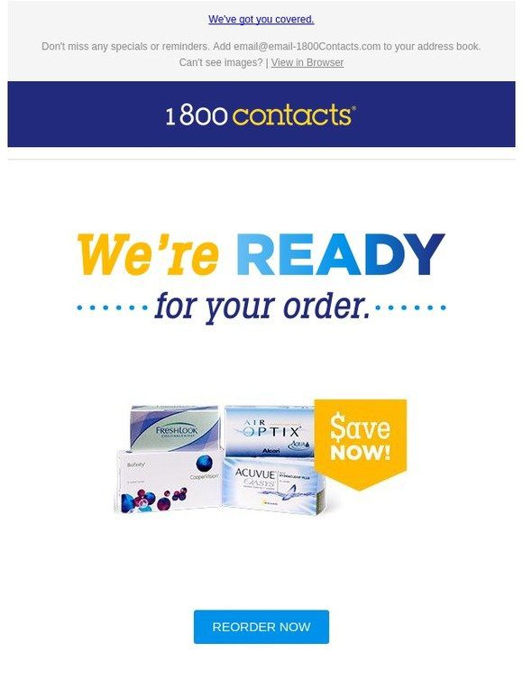
Why we like it: It’s a personalized email, and the content (and CTA) is likely beneficial to the reader. This email is probably set up regularly based on when an average contact user would start running out of their contacts, so instead of confusing the message, 1-800-Contacts is merely giving the user something they likely need.
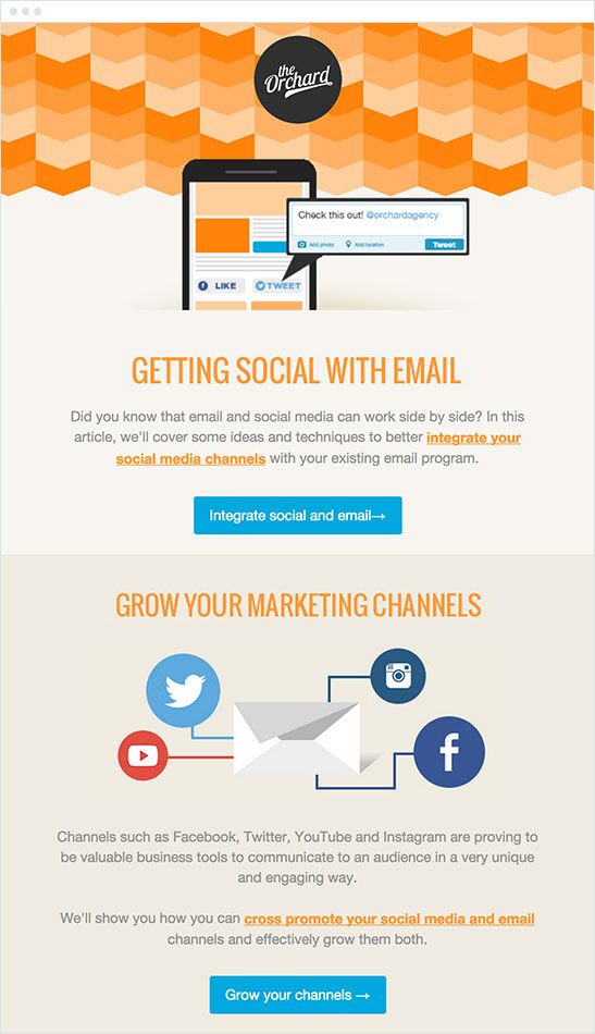
Why we like it: The CTAs tell you precisely what you’re going to get out of clicking them. And while there are 2 CTA buttons on this email, there’s a clear delineation between the two types of content, and they don’t necessarily compete with each other in this column design.
Create purposeful emails with MAKE
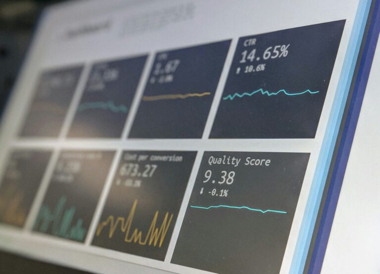
While these rules can help you create an email marketing strategy that may help you increase revenue and CTRs, it’s not a guarantee.
A good marketing strategy is one that’s developed over time, with iterations and testing and a whole lot of patience.
If you want to partner with a company that knows all the rules for a good CTA in email marketing, but also when it’s OK to break them for the greater good, we’re your team. Get in touch with us today to learn more about how we can help you turn your boring newsletters into converting masterpieces.