City Rent A Truck is a family-owned truck and van rental operation in Kansas City, Missouri. Named initially South Town Leasing, the company got its start as the leasing department of a local Ford franchise in 1964. Today, it’s a thriving nationwide business (seriously, after reading this, you’ll see their vehicles everywhere) with a passion for customer service. But, that rich history comes with its challenges, like an outdated email presence and process.
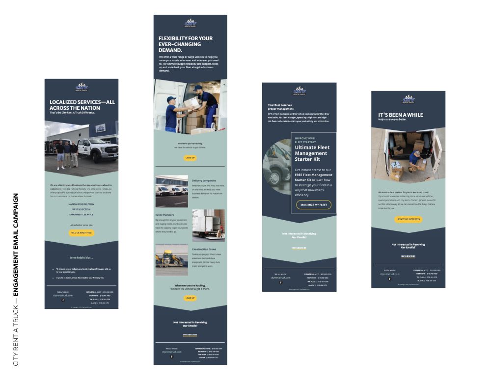
Our team was tasked with redesigning City Rent a Truck’s entire email presence to convey a more professional and direct email campaign approach filled with strategic design and implementation decisions.
Challenge: Even though City Rent a Truck had a massive list of subscribers (25,000+), many of the emails were going to spam folders or ignored altogether. The company had an open rate of 5.7% (way below the industry standard of about 18%).
Solution: Revamp the email process to re-engage subscribers or kick them off the list completely. We also transitioned the company from Constant Contact to MailChimp and designed a completely new look and feel for its emails that matched the new website and branding. Since cleaning the list and implementing email best practices, City Rent a Truck’s average open rate increased to 42.85%
“MAKE Digital Group, you guys should give yourself a pat on the back…these results are significant and this is work well done.”
— Jeff Schuetz, City Rent a Truck Owner/CEO
CLEANED LIST + ‘FROM’ FIELD INFORMATION
When it was brought to our attention that emails were going to spam, it was clear that something was wrong in the email campaign process—the question, though, was what.
First, we used third-party software to remove those from the list that were seen as potential spam traps or were no longer in use. After that, we used our email design to make the option to unsubscribe to be more prominent in hopes that users would unsubscribe instead of reporting CRAT as spam. As the campaign moved forward, the email service provider (ESP) we used (MailChimp) helped to clean the list for any emails that had hard or soft-bounced more than once. This has led to an overall healthier and engaged list of email subscribers.
We also discovered that, at some point, the “From” field in the emails had been changed from “jake@cityrentatruck” to “info@cityrentatruck.” We found that by changing it back to the original email, we improved Mailchimp deliverability. Easy peasy fix with long-term gains.
INCREASED PERSONALIZATION + SEGMENTATION
City Rent a Truck was blasting its entire 25,000-person email list with basic and broad messaging. We needed a reliable and consistent email plan that added value to the consumer and provides frequent, consistent content.
Our first step was to identify engaged and unengaged consumers by segmenting our existing lists based on the level of engagement recording in MailChimp. Here was our approach:
- Engaged Users: Segment these by leveraging an Engaged Leads Segmentation campaign. These were a series of emails devised to capture more input from the consumer regarding the type of message they’d like to receive and include high-value marketing materials like Complete Guides or Starter Kits.
- Lapsed Customers: Segment by leveraging a Win Back campaign. These were a series of emails devised to pull consumers back into engaging with our brand with a free hat giveaway and an option to unsubscribe.
The goal of the email content was to write it in a way that was short, sweet, and to the point: Working to drive a consumer to an action. Because there were multiple emails in the funnel, meaning multiple opportunities for people to engage, we were able to see what type of information and links were considered useful to the audience.
Moving forward, these data insights will be used to create a more personalized approach to email messaging that encourages users to engage and ultimately convert.
UPDATED DESIGN + FUNCTIONALITY
The old email design was stagnant and repetitive. We wanted to enhance the branding in the emails to ensure that our recipients remember the brand, their previous interactions with the brand, and opted-in to receive communication from the brand. We also clearly identified the opportunity to “unsubscribe” to avoid the consumers marking emails as spam.

Our new design is clean, modern, and ultimately a better representation of the company as a whole. Plus, our designer Gabbi loved the challenge.
SMARTER SUBJECT LINES WITH A/B TESTING
Every email had an A/B test on the subject lines. We learned that direct messaging performed the best in subject lines with a 51.18% open rate through 5 emails. We also learned that question-based subject lines didn’t perform as well at 41.1% for 4 emails.
- A: “Upgrade your fleet with these heavy-duty trucks” (40.4% open rate)
B: “Is your fleet up to the challenge?” (35.3% open rate) - A: “How to save time + money on group travel →” (49% open rate)
B: “Traveling with a group? These rentals are for you.” (40.8% open rate)
These insights will help us tailor our subject lines down the road to maximize open rates and engagement from our subscribers.


