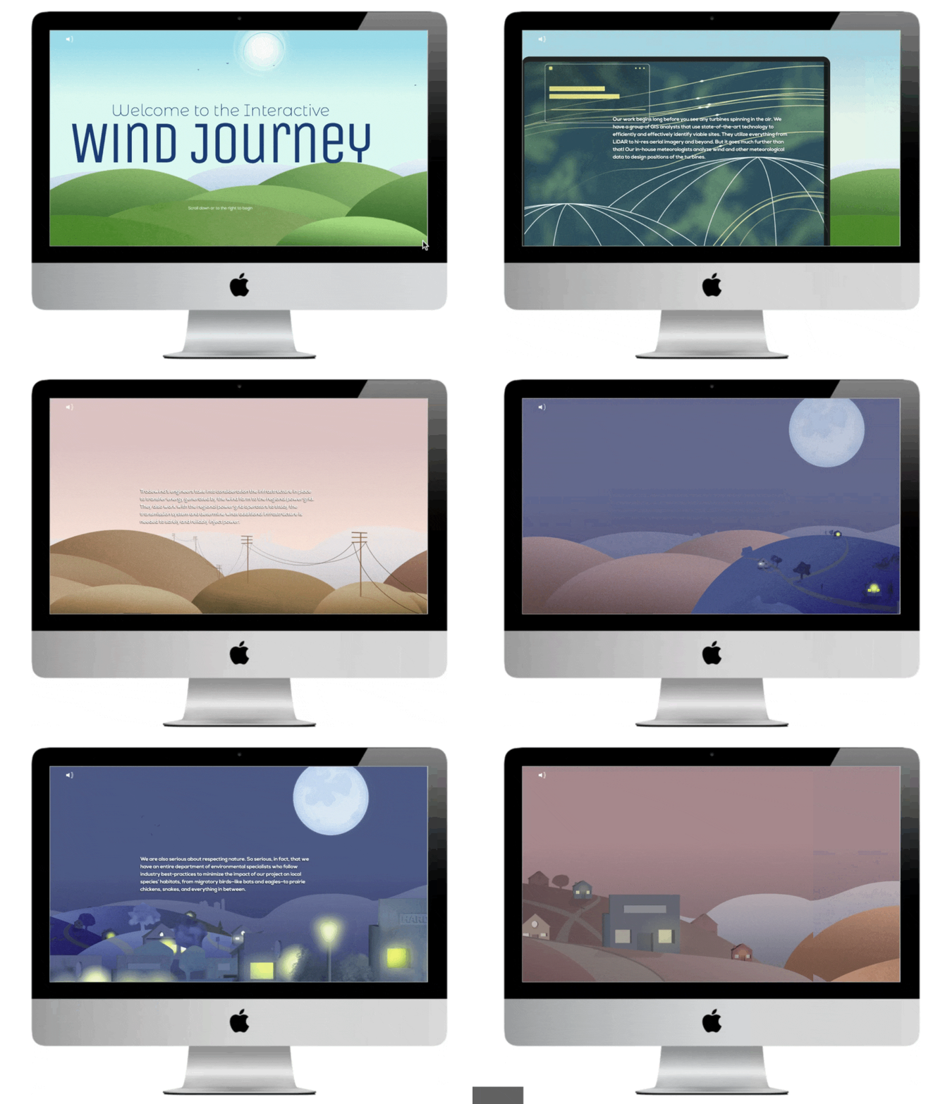
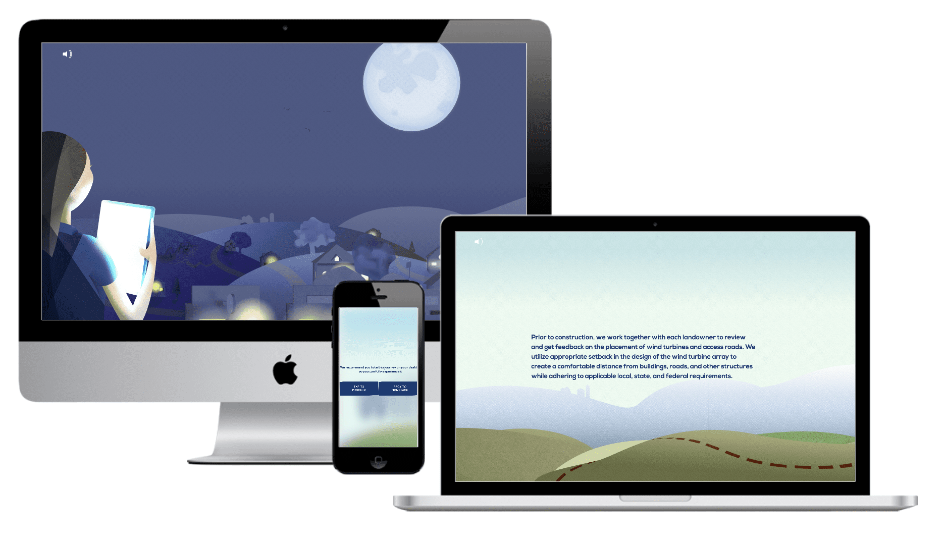
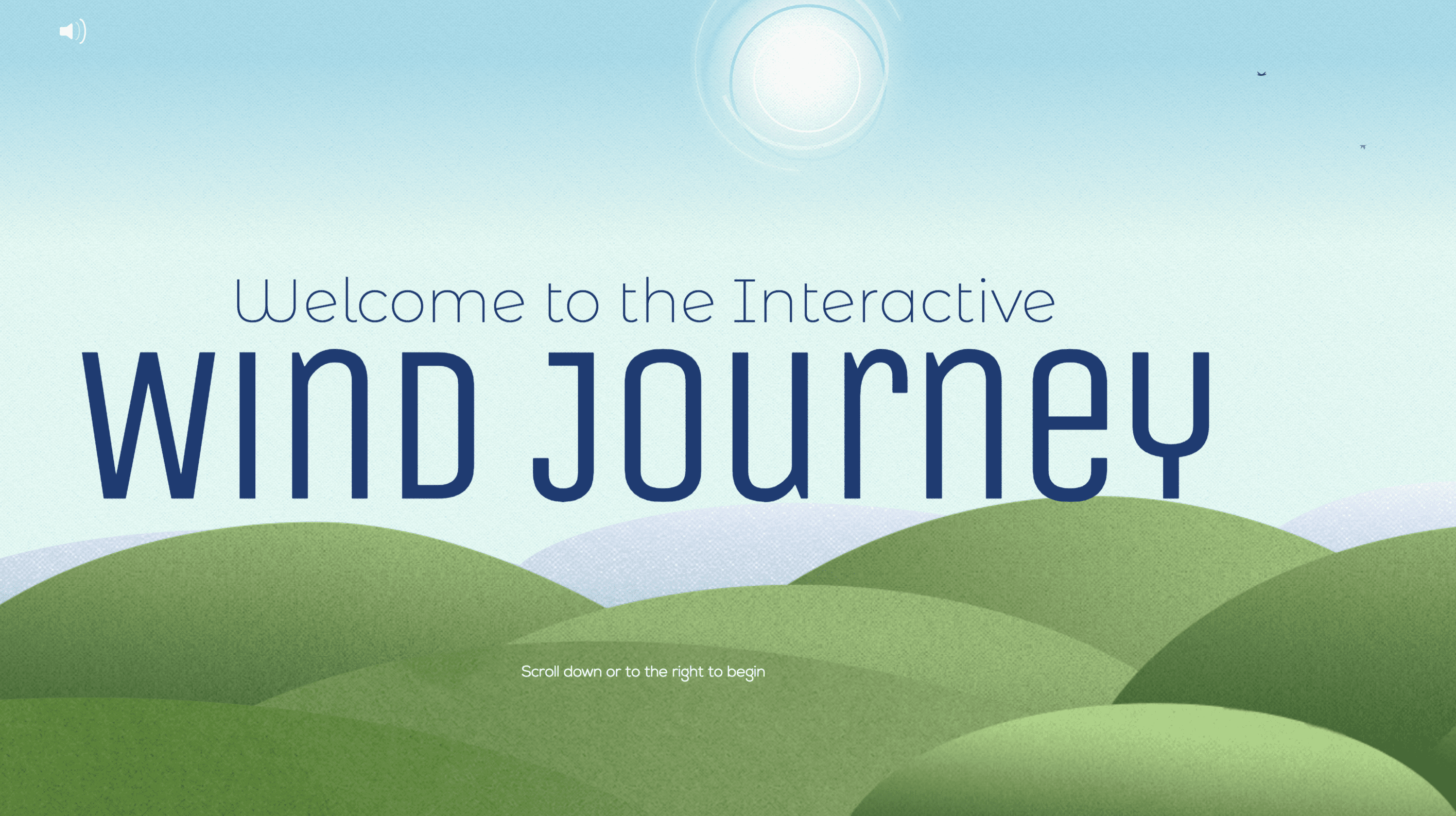
Our latest project for Tradewind Energy has been one of MAKE’s most exciting and boundary-pushing projects to date. This interactive, experiential mini-site takes the user through the journey of Tradewind and how they thoughtfully develop each project with expertise while maintaining respect for the environment, communities, and land owners.
The Project Objective
Educate landowners on the process of developing a wind farm. We wanted to demystify misconceptions about certain aspects of the wind development process like land erosion, animal disruption, and effects on the community.
The Beginning
MAKE wanted to engage users with interactive and exciting design without using the typical video approach.

And so, the Wind Journey was born. The first version was more rudimentary. The “journey” took users through an animated path, almost like an infographic. From that project morphed the more developed version of the Wind Journey. We designed, built, and integrated a working project that took the user through the land of wind turbines. While the product was good, we knew that the potential for the wind journey could be even greater, so back to the drawing board we went.
The Final Product
Together, Tradewind Energy and MAKE sat down to conceptualize what would become the final version of the Wind Journey: a side scrolling, interactive, animated journey with contrasting imagery from scene to scene.

Designer and developer, Ryan Hannebaum, shared that the most challenging (and exciting) part of the project was combining the level of animation we wanted with the flexibility for the project to perform optimally on multiple devices and screen sizes. We really strived to maintain good enough performance for the end product to be a deliverable that was easy to navigate and fun to use.

Equally invigorating was planning to strike the right balance when we considered the design. The goal? A fun aesthetic without becoming too animated.
After all, we’re telling a serious story — one aimed at rural landowners. Something Ryan kept in the back of his mind throughout the design process was to push the boundaries of what companies would “typically” market to landowners. He wanted to strike the right tone visually to appeal to this market, while pushing the edges of creativity.
At the end, MAKE was able to create a journey for Tradewind that fulfilled the purpose of educating landowners on the benefits of wind turbines and pulls back the curtain on the wind project development process. This project allowed MAKE designers and developers to push their comfort zones, take risks, and problem solve — boxes that all of our favorite projects check.
What did our designers love most? “Finding new ways to push the boundaries of existing technology, getting to solve a complex problem with animation,” Ryan shared.


